Why Some Images Demand Black and White
In my last post I talked about colour and how sometimes a frame is so tied to its tones that stripping them away would be a mistake. But this image represents the other side of the coin: those moments when black and white isn’t just an option, it’s the only choice that makes sense.
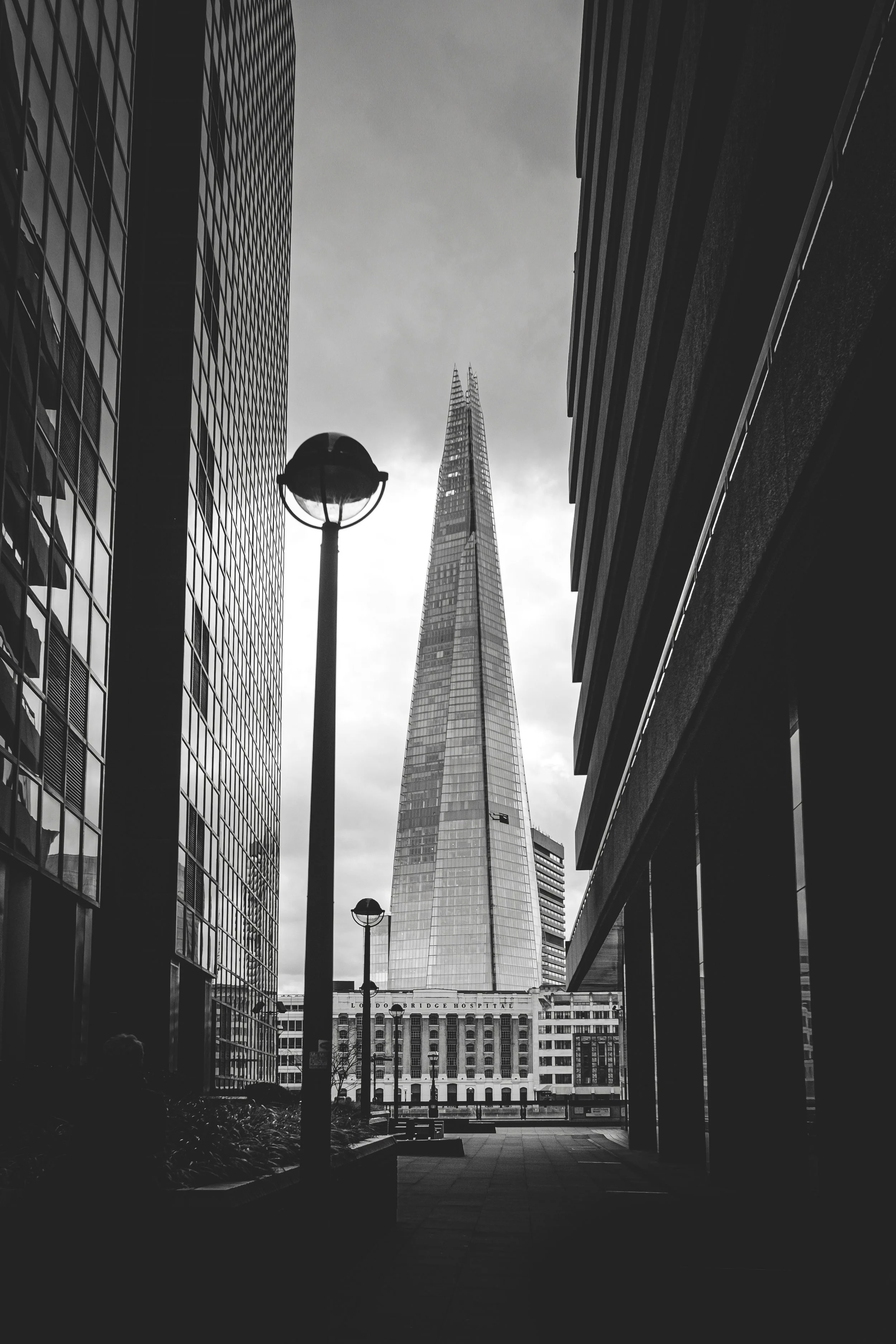
This photograph of The Shard is one of my older images, but it’s still a favourite. In fact, I used it as the cover for my book on shooting in black and white- partly because of its graphic strength, but mostly because it embodies exactly why monochrome can be so powerful.
Colour would have distracted here. The Shard sits framed between two blocks of shadow, rising sharp and geometric into a sky that, on the day, wasn’t offering much more than dull tones. Strip away the colour and what you’re left with is contrast, shape, and light. The lamppost in the foreground becomes a counterpoint to the sharp vertical of the tower, while the dark framing on either side makes the centre pop. It’s geometry, tension, and balance which are all made stronger by the absence of colour.
Street and city photography often wrestle with this question: colour or monochrome? For me, the answer isn’t about habit or style but more about honesty. What’s the photograph trying to say, and what treatment makes that message clearest? With The Shard, black and white stripped away everything unnecessary and left the image with a timelessness that colour couldn’t have delivered.
That’s why it became the cover of my book. Not because it’s my sharpest or most technically perfect frame, but because it represents a decision every photographer faces: when to let colour carry the picture, and when to let form do all the work.